
There’s not much to love about houses designed and built in the 1980s, especially ones blessed (or maybe cursed) by bountiful budgets. The existing structure for this down-to-the-studs remodel was, says architect Joeb Moore, FAIA, “a mutt of architecture. I don’t even know what style to call it. It was a bit of an oversized ranch with an applique of colonial elements. It was just a very poorly conceived and proportioned house.” Certainly, the house committed more than a few design misdemeanors (round-top windows, anyone?), but the biggest crime was squandering a spectacular site on Long Island Sound.
Joeb and his clients, who are also good friends, deliberated for some time about whether to tear down the house and build anew. The clients had grown tired of the traditional house they owned next door to this one and wanted something fresh and modern, something to complement and showcase their burgeoning, serious art collection. This house also occupied a better site, with closer proximity to the water, aspects they hoped a redo would harness. Ultimately, the determining factor was the area’s restrictive building codes. If they tore down the house, they would have to reduce the square footage by a third. With three children and the growing art collection to accommodate, no one felt the sacrifice was worth it.
So, it fell to Joeb, project architect Thalassa Curtis, AIA, builder David Prutting, and team to transform the 7,900-square-foot “mutt” into a purebred. Among the design flaws they faced were poor visual connections to the water at the rear and an awkward entry sequence at the front. There were low ceilings, too—everywhere. And then there was the pervasive homeliness of the aesthetics. All this needed fixing within the footprint of the original house and the height restrictions imposed by code.

The original house made little use of its scenic site and had no stylistic cohesion
The big move was to raise the ceiling height. “We did a series of studies and investigations of how we could keep the house’s footprint and strip it down to the studs,” Joeb recalls. “And what we found was, if we tore out the floor plan and the crazy spiral stair, then we could raise the first-floor ceiling from 6’8” to 9 feet. It was a profound change, and what we were left with was quite adaptive. We raised all the windows and doors to that height as well, and that allowed us unbroken views of the water while moving through the house.”
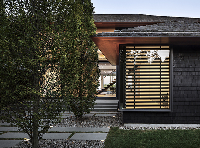
The rear of the house is now nearly entirely a curtain of glass, trimmed in black steel and recessed behind deep overhangs to shield from the southeastern exposure (there are wood screens and hidden window shades, too, throughout). The team extended the roof elements to achieve the overhangs, sistering rafters and bringing edges to a sharp, modern point. The soffits are clad in warm mahogany, in contrast to the deep gray of the shingle siding—a color choice that caused a months-long debate.
“I felt very strongly that we needed the color to neutralize this house,” says Joeb. “It took 15 different samples to get just the right semi-gloss feel and light play. Sometimes it reads as gray, sometimes as black. Over eight months, we kept putting up the samples. And then finally, I said, ‘You just need to trust me. I’m certain it’s the right thing to do. And they did.’”
The dark color and deep overhanging roofs contribute an almost Asian feel to the house. “We had previously extended roofs on a lake house by Peter Ogden, and it really transformed it,” Joeb explains. “It brings the scale of the house down. Understanding proportion and the scale of the body is the fundamental character of beauty. There’s a dialogue to scale, and a dialogue to contrasts—that’s what modern is about. When we extended the rooflines here, it made the house more horizontal and quiet. It sits on its hillside like a cap. The overhangs cast their own shadows, making the siding even darker and suspending the house in space.”


Prologue to Dialogue
Sorting out the entry sequence was another priority of the redesign. Joeb’s office devised a master plan with landscape architect Edmund Hollander of Hollander Designs to mitigate the awkward approach of the rear lot site. “Rear lots tend to have a very narrow drive, then it forks open to the water views. Getting a sense of arrival is very difficult,” says Joeb. “The approach could not be axial; we had to come at it from an oblique angle.”
Visitors arrive at the guest motor court, proceed past a cedar wall divider that shields the family motor court, and continue down a formal walkway of pavers set in grass. They pass through a “trapezoidal funnel shape” and into a “bosque” of tall trees that establishes the entry court. The trees create a vertical allée that directs to the 9-foot-tall-by-7-foot-wide front pivot door. The vertical threshold segues into a two-story foyer and gallery space. Beyond, visitors see a breathtaking, horizontally framed water view.
There is a trick to that view—a manipulation of perspective created by the disappearing-edge pool and the slope of the site down to the water. The pool and sea seem to merge together into a single watery plane.
“We were hoping for a progression of spaces. And that was very key in section,” says Joeb. “The entry garden, the two-story entry gallery, passing through the dining room, and seeing past this cascading infinity pool, 40 feet above the sound. When you’re standing in any of these areas, you feel the pool is part of the Sound. When you turn to the left or the right, away from the water, you engage the galleries and the art.” The installed art participates in the dialogue of vertical and horizontal, as well. An example is the polka dot triptych that tops the long, low fireplace in the living room, both referring subtly to the horizontal water view.


Although the renovation moves the house solidly toward modernism, the kitchen redo splits the baby at what some would call “transitional.” This room was the domain of the wife, who worked closely with Thalassa to achieve the utility and look she wanted. “She wanted a kitchen where she can reach her plates,” says Joeb. “So, we measured down to the inch what could be reached. As a result, the kitchen works incredibly well.” The gently paneled white cabinetry is sharpened by clear hardware and steel elements, and, he adds, the room’s “bilateral symmetry keeps it clean, minimal, and modern.”
The kitchen’s positioning pivots easily among informal dining, formal dining, and an outdoor covered eating area overlooking the water. The new covered porch addition, allowed because it is not conditioned space, continues across the back of the house and marks a fresh, modern line for the rear elevation. “This really helped unify the massing, which was a bit out of control,” Joeb explains. “We were able to simplify and use that line to create incredible transition spaces. They also help protect the house from southeast exposure and afforded a transparency and reflection to the glass.”


On the first level, the porch element provides covered outdoor areas and, on the second level, an expansive deck that serves all but one bedroom. The roof overhang partially shields the deck and shades interiors spaces from the sun. A glass barrier preserves the deck’s water views.
Not every builder is up to such a demanding reinvention, but Dave Prutting and his team know a thing or two about executing precision architecture. Joeb and Dave have collaborated on multiple projects. Dave even hired Joeb to renovate his former home, a midcentury work by Eliot Noyes. “I’ve worked with them for 17 years,” says Joeb. “They are a phenomenal project management group. I deal with a lot of construction firms from New York City up to Boston, and they are simply the best at project management and figuring out the constructability of elements. They are a true team player and collaborator. They are also the best at balancing construction science and design clarity and resolution. It’s clear they love what they do.”
It’s clear Joeb does, too. His passion for architecture is free ranging and inclusive. It can absorb a mutt of a house and detangle its knots, attend to its gaps in comportment, and reshape it into a dignified, handsome creature. Even after all the interventions, Joeb stops just short of calling it a purebred modern house now. “It’s not quite modern and it’s not quite radical contemporary. It’s really a modified modern.”
Stripped down, sorted out, and cleaned up, the building recedes into a clean, sharp frame for the art within and the stunning natural views without.


Plans and Drawings


Project Credits
Harbor Residence
Coastal Connecticut
ARCHITECT: Principal-in-charge Joeb Moore; project architect Thalassa Curtis, Joeb Moore & Partners, Greenwich, Conn.
BUILDER: David Prutting, Prutting & Company, Stamford, Conn.
INTERIOR DESIGNER: Sally Markham, Old Greenwich, Conn.
LANDSCAPE ARCHITECT: Edmund Hollander, Hollander Design, New York
PROJECT SIZE: 7,900 Square feet
SITE SIZE: Withheld
CONSTRUCTION COST: Withheld
PHOTOGRAPHY: David Sundberg/ESTO
Key Products
ARCHITECTURAL HARDWARE: Rajack
CLADDING: Alaskan Yellow Cedar
COOKTOP: Wolf
COUNTERTOPS: Corian, stone
DISHWASHER: Miele
ENTRY DOORS/WINDOWS: Dynamic
FAUCETS: Dornbracht, Vola, Fantini, Speakman, Waterworks
FLOORING: Porcelanosa, Ann Sacks
GARAGE DOORS: Legacy Doors
HVAC: Carrier
OVENS: Miele
PAINTS/STAINS: Farrow & Ball, Benjamin Moore, Sikkens
REFRIGERATOR/WINE UNIT: Sub-Zero
ROOFING: Alaskan Yellow Cedar
SCREEN SYSTEMS: Phantom Screens
SINKS: Julien (kitchen), Caesarstone (master), Kohler, Porcelanosa, Corian
TOILETS: TOTO
TUBS: WetStyle
WASHER/DRYER: Whirlpool